
Designing
Through a digital landscape
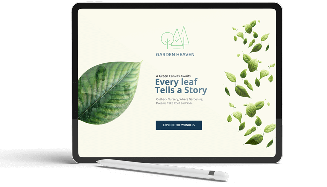
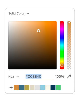
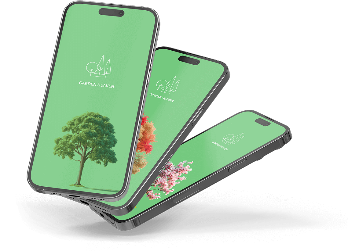
The use of a vibrant and naturalistic color palette alongside playful yet readable typography
mirrors the nursery's brand identity, emphasizing a fresh and organic feel.
High-resolution images of plants and a clear, appealing layout engage users visually while
making navigation intuitive.
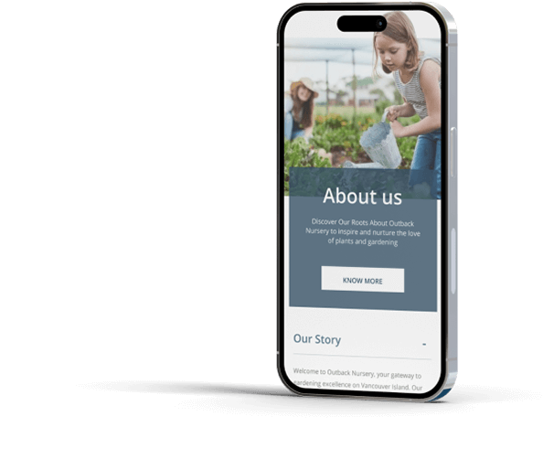
The layout is structured to guide users through the site effortlessly, with well-defined
sections that highlight key information and calls to action.

Experience
The detailed plant guides
Each element of the design is crafted to not only look appealing but also to facilitate an enjoyable and effective user journey, ensuring that the digital experience is as enriching as the nursery's physical counterpart.


